
In the world of visual marketing, grabbing attention is everything. Whether you’re working with exhibition display stands or fitting out shell scheme graphics, the right coordination of lighting and design plays a vital role in how effectively your message is delivered. Many businesses overlook the importance of lighting when planning their graphics, resulting in displays that fall flat or go unnoticed. This blog explores how the right lighting and graphics can work together to maximise visibility and create lasting impressions in any space.
The Science Behind Visibility
Our eyes are naturally drawn to light and contrast. When light is used effectively, it can enhance colours, highlight details, and draw attention to key messages. Conversely, poor lighting can distort colours, create unwanted shadows, and reduce readability. A well-lit space with coordinated graphics ensures that viewers can quickly absorb the information being presented.
Colour perception is also heavily influenced by lighting. A bright red under warm lighting might appear more orange, while cooler lights can make certain colours appear dull. That’s why it's crucial to understand the interplay between graphic design and lighting temperatures—what works on screen or in daylight may not translate well in an indoor exhibition environment.
The Role of Lighting in Display Effectiveness
Lighting does more than just illuminate—it sets the mood, directs focus, and enhances legibility. Here are a few key lighting types used in display environments:
- Ambient Lighting: This is the general lighting in a room or venue. It ensures overall visibility but doesn’t necessarily highlight specific graphics.
- Accent Lighting: Used to spotlight key areas or features in your display. Perfect for drawing attention to promotional messages or brand logos.
- Task Lighting: This is more focused and is used to help staff or visitors interact with a space, for instance, at a product demonstration table.
- Decorative Lighting: Adds visual interest and can enhance the aesthetic appeal of a display.
LED lighting has become increasingly popular due to its energy efficiency and flexibility. Backlighting is also commonly used behind printed panels to make text and images stand out. For example, a simple graphic on a shell scheme wall can be transformed into a show-stopper when paired with subtle but effective lighting.
Without the right lighting, even the most professionally designed graphics can lose their impact. Dull environments or poorly aimed lights can leave crucial elements in the shadows or make text difficult to read.
Designing Graphics with Lighting in Mind
Graphics must be created with the final display environment in mind. This includes knowing how they will be lit. Here are some important design considerations:
- Colour Choices: Certain colours may appear brighter or duller depending on the light. For instance, dark blues and blacks might lose their depth under weak lighting.
- Font Selection: Fonts should be bold and legible, especially under bright or changing light conditions. Avoid overly thin or decorative typefaces that might disappear under certain lighting.
- Material Matters: Graphics can be printed on reflective, matte, or translucent materials. Each reacts differently to light. Matte materials reduce glare, while glossy finishes can enhance colours but may reflect too much light.
- Contrast and Spacing: Ensure there’s enough contrast between text and background, and that spacing allows easy reading from a distance.
For shell scheme graphics, which are often mounted within modular panels, ensuring the lighting highlights all sections equally is crucial. Uneven lighting can cause sections of your message to be lost.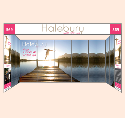
Combining Lighting & Graphics for Maximum Impact
When graphics and lighting are designed together from the start, the results are far more effective. Here are two examples of how this synergy works in real scenarios:
Example 1: Retail Window Display
A retail store wants to promote a seasonal sale using a window display. By using warm-toned LED backlighting behind vinyl window graphics, the message stands out both during the day and at night. Accent lighting from above draws attention to the central graphic, while additional lights highlight product displays beneath.
Example 2: Exhibition Display Stand
At a trade show, a company uses a shell scheme with printed foamex boards. Each panel is paired with adjustable spotlights. The main message sits at eye level and is illuminated by soft overhead LEDs, while lower sections are subtly lit from the floor. The lighting and graphics work together to guide the viewer’s eye from top to bottom, making sure nothing is missed.
Tips for Better Lighting and Graphic Integration:
- Use mock-ups to test visibility in advance.
- Align light temperature (warm/cool) with your brand colours.
- Consider dimmable lighting options for versatility.
- Avoid placing lights where they cast shadows on key content.
- Ensure lights are adjustable and well-secured during events.
Indoor vs Outdoor Considerations
When planning displays for different environments, it’s essential to adapt your lighting and graphic strategy accordingly.
Outdoor Displays
Natural lighting varies greatly throughout the day. Consider using anti-glare laminates and bold, high-contrast colours to maintain visibility in bright sunlight. Battery-powered LED floodlights can enhance night-time visibility. For permanent signage, solar-powered lighting is both effective and eco-friendly.
Indoor Displays
Indoor lighting is more controllable, allowing for specific effects. Use ceiling lights, floor uplighters, or lightboxes to highlight important areas. For shell scheme graphics, the overhead lighting supplied by event organisers is often insufficient, so bringing your own spotlights or integrated backlighting is recommended.
Common Mistakes to Avoid
Even with the best intentions, some common missteps can hinder your display’s effectiveness:
- Overpowering Lights: Lights that are too bright can make it hard to read text or view graphics comfortably.
- Poor Positioning: Lights placed at awkward angles can create shadows or uneven lighting.
- Mismatched Materials: Using glossy materials with direct lighting can lead to excessive glare.
- No Planning: Waiting until the day of the event to consider lighting can result in poor coordination and last-minute compromises.
Future Trends in Lighting and Graphics
As technology evolves, so does the approach to signage and displays. Some emerging trends include:
- Smart Lighting: Lighting systems that adjust automatically to ambient conditions or foot traffic.
- Motion-Activated Displays: Lights and screens that respond to visitor movement to create a dynamic experience.
- Eco-Friendly Solutions: LED technology continues to lead in sustainability, and more brands are embracing solar-powered or low-energy lighting.
- Interactive Graphics: Touch-sensitive surfaces or light-reactive inks can bring static displays to life.
These innovations can be integrated into everything from small exhibition display stands to large-scale retail environments.
Conclusion
In today’s competitive market, visibility is everything. The strategic use of lighting and graphic coordination can transform even the simplest shell scheme graphics or exhibition display stands into compelling, high-impact visuals. Whether you're setting up at an exhibition or designing a permanent retail fixture, planning both elements together ensures your brand shines—literally and figuratively.
For expertly designed graphics and lighting-ready print solutions, trust the experienced team at VC Print to help your business stand out in any environment.


